 Industries we serve
HealthcareRetailLogisticsReal estateEducationFinance
Products running in six industries, from clinics to warehouses.



Websites, apps and software built for clarity, speed and growth.
Clear plans.Careful execution.
✦ From idea to launch, and after.
A snapshot of ourexperience and results.
Industries we serveProducts running in six industries, from clinics to warehouses.
of our clients come back for a second project.

Different skills.
One standard.
Numbers, industries and projects on this page are samples until GEMSOFT shares real ones.
 2025
2025
iOS and Android app that lets patients book, pay and get reminders in under a minute.
 2025
2025
Shopify store with fast product pages, local payments and connected inventory.
 2024
2024
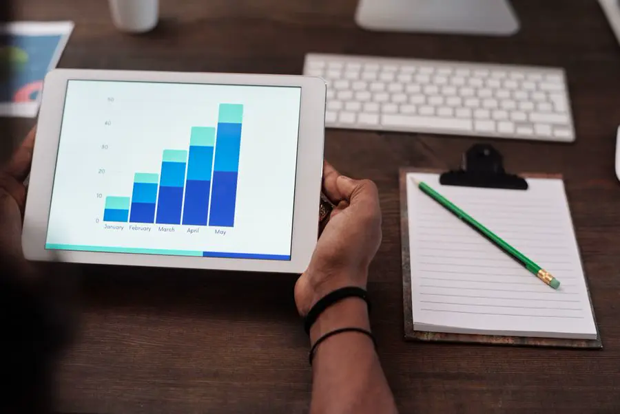
One live dashboard that replaced fourteen spreadsheets for a distribution team.
 2024
2024
Listings site with map search, lead forms and a CMS the sales team updates daily.
 2025
2025
Assistant that answers customer questions from company policies, with handover to staff.
 2023
2023
Online ordering and kitchen screens for a five-branch restaurant group.
We are here to help you grow without the hassle. No juniors. No runaround. Just experienced people ready to help.
Work with usiOS and Android app that lets patients book, pay and get reminders in under a minute.
A group of three family clinics wanted to stop losing patients to long phone queues. Every appointment was booked by phone, written in a paper diary and confirmed by hand, so the front desk was always busy and patients often gave up before they got through.
We designed and built a booking app for patients and a web panel for staff. Patients now choose a doctor, see real free slots, pay and get reminders in one place, while the clinic keeps full control of schedules, branches and payments.
Phone booking was the only option, and the lines were busiest exactly when patients wanted to call: early morning and after work. Missed calls meant missed appointments, and around one in five booked patients did not show up because nobody reminded them.
The app also had to suit everyone, from young parents to elderly patients who rarely use apps. It needed to work in English and Urdu, handle three branches with different doctors and timings, and keep medical information private.
We started with two days at the front desk, listening to real calls and noting every question patients asked. That gave us the shortest possible booking path: choose a doctor, pick a time, confirm, pay. Everything else was moved out of the way.
Designs were tested with patients of different ages before any code was written. We built one Flutter app for iOS and Android so both work the same, connected it to a secure Node.js API, and gave staff a web panel to open, block and move slots in real time.
Most bookings now happen in the app, many of them at night when the clinic is closed. Automatic reminders before each visit cut no-shows sharply, so doctors' time is used properly.
The front desk spends its day with patients in the clinic instead of on the phone, and the owners see bookings, payments and busy hours for every branch in one report.
Large text, clear buttons and a language switch on the first screen mean elderly patients can book without help. Each step shows only one decision, so nobody gets lost.
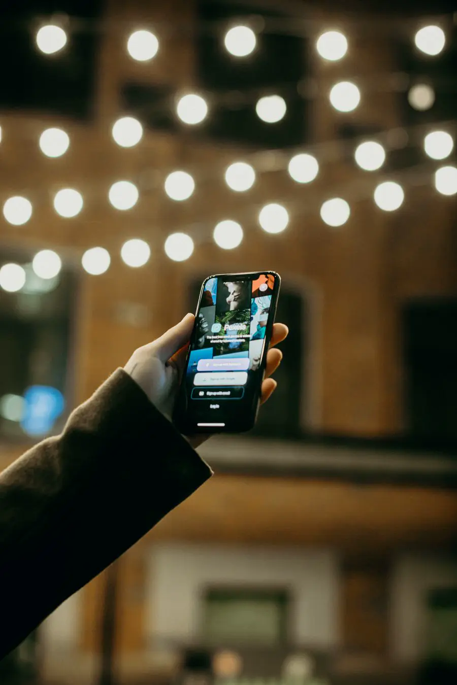

Doctors' timings, leave and breaks live in one place. When staff block a slot in the panel, it disappears from the app the same second, so double bookings are impossible.

Patients get a reminder the day before and two hours before their visit, with one tap to confirm or move it. Freed slots go straight back on sale.
Shopify store with fast product pages, local payments and connected inventory.
A growing clothing brand was selling almost entirely through Instagram messages. Customers asked for prices and sizes one by one, orders were written in a notebook, and the team often sold items that were already out of stock.
We built a Shopify store that turns their strong product photos into a fast shopping experience, with local payments, delivery rules and inventory that stays correct on its own.
Every sale needed a long chat, and the team could only answer so many messages a day. Stock was counted by hand, so popular items were often oversold and customers were disappointed.
The old website was slow on mobile phones, where almost all of their customers shop. Product pages took too long to load, and many people left at checkout because cash on delivery and local cards were not supported.
We planned the store around how their customers actually shop: on a phone, from an Instagram link, looking for one item in their size. Product pages show large photos, a size guide and stock per size, with a short checkout of only a few fields.
Local card payments, wallets and cash on delivery were added with clear shipping rules for each city. Inventory connects to the warehouse, so stock updates the moment an order is placed. We also tuned images, themes and apps so pages load fast on mobile data.
Customers now buy on their own, at any hour, without waiting for a reply. More visitors reach checkout and finish it, and overselling has stopped because stock is always up to date.
The team spends its time on new collections and marketing instead of copying orders from chats into spreadsheets, and every sale is tracked in one dashboard.
The brand's photography is its strongest asset, so every page is built around it. Large images, a clean layout and quick colour and size switches keep the focus on the clothes.



Card, wallet and cash on delivery sit side by side, with delivery cost shown before the last step. No surprises means fewer abandoned carts.

Each order updates the warehouse count straight away, and low-stock items are flagged so the team can restock popular sizes in time.
One live dashboard that replaced fourteen spreadsheets for a distribution team.
A regional distribution company moved thousands of parcels a week, but planned everything in fourteen separate spreadsheets. Dispatchers, warehouse staff and managers each had their own version, and none of them matched.
We replaced the spreadsheets with one live operations dashboard that pulls data from their order system and driver app, so everyone sees the same numbers at the same time.
Daily reports took hours to prepare by hand and were already out of date when they were shared. Managers could not tell which shipments were running late until customers called to complain.
Data lived in many places: the order system, the driver app, the warehouse sheet and email. Any new tool had to connect to all of them without stopping daily work, and it had to be simple enough for staff who had only ever used Excel.
We spent time with dispatchers and managers to learn which numbers they checked every hour and which decisions depended on them. The dashboard was designed around those questions, not around the data tables.
We connected the order system and driver app through secure APIs, cleaned and combined the data, and built a React dashboard with live maps, shipment lists and alerts. It runs on the cloud with daily backups, and each role sees only what it needs.
All fourteen spreadsheets are gone. Managers see every shipment, driver and delay live, and reports that took hours are ready in seconds.
Late shipments are flagged before customers notice, so the team can reroute drivers or call ahead. Decisions are now based on one shared set of numbers.

Shipments, drivers, warehouse stock and delays sit on one screen. Colours show what needs attention, so a dispatcher can understand the day in a glance.



Orders, driver updates and stock levels flow in automatically. Nobody copies numbers between files any more, so mistakes from manual entry have disappeared.

When a delivery is about to run late or stock is running low, the right person gets an alert straight away, with the details they need to act.
Listings site with map search, lead forms and a CMS the sales team updates daily.
A real estate agency with hundreds of active listings had a website that only one developer could update. New properties took days to appear, and sold ones stayed online for weeks.
We built a fast listings website with map search and a simple CMS, so the sales team can publish and update properties themselves, and every enquiry goes straight into their lead list.
Buyers could not search by area, budget or property type, so they scrolled through long pages or gave up. Enquiries arrived by email with no record of who had replied, and many leads were lost.
The agency also wanted to be found on Google for searches in their areas, but the old site had slow pages and no proper structure for search engines.
We designed the site around the buyer's search: a map, simple filters for area, budget and type, and large photo galleries for every property. Each listing page shows the key facts first, then photos, location and a short enquiry form.
A headless CMS lets the sales team add, edit and mark properties as sold in minutes, without a developer. Every listing is structured for search engines, and enquiry forms feed a lead list with alerts so no buyer waits for a reply.
New listings now go live the same day, and sold properties are removed immediately. Visitors find matching homes faster and send more enquiries.
Organic search brings a steady flow of local buyers, and the sales team follows up every lead from one list instead of searching through email.

Buyers start with a place and a budget, so the map and filters are the first thing they see. Results update as they move the map.



The sales team fills in one simple form with photos, price and details. The CMS handles image sizes, page layout and search data automatically.

Every enquiry lands in one list with the property, buyer details and status, and the assigned agent gets an alert straight away.
Assistant that answers customer questions from company policies, with handover to staff.
A services company's support team answered the same questions about pricing, policies and timelines all day. Customers waited hours for answers that were already written in company documents.
We built an AI assistant that answers from the company's own approved content, shows where each answer comes from, and hands the chat to a person whenever it is unsure.
The support team was stretched, replies were slow outside office hours, and simple questions crowded out the cases that really needed a person.
Leadership was worried about AI giving wrong or invented answers. The assistant had to stay strictly within company policy, protect customer data and make it easy to reach a real person.
We gathered the company's policies, FAQs and price lists into one approved knowledge base and connected the assistant only to that content. Every answer links to its source, and when confidence is low the assistant says so and offers a person.
Handover happens inside the same chat, with the full conversation passed to the staff member. A simple dashboard shows the most common questions and any gaps in the documents, so the team can keep improving the content.
Customers get correct answers in seconds, day and night, on the website and WhatsApp. The support team now focuses on complex cases that need a human touch.
Because every answer is linked to a source and gaps are visible, leadership trusts the assistant and the knowledge base keeps getting better every week.

Each reply shows the policy or page it came from. Customers can read more, and staff can see exactly why the assistant answered the way it did.

If the question is sensitive or the assistant is unsure, it hands the chat to a team member with the full history, so the customer never repeats themselves.
The dashboard shows what customers ask most and where documents are missing. The team fills those gaps, and the assistant improves straight away.
Online ordering and kitchen screens for a five-branch restaurant group.
A restaurant group with five branches relied on phone orders and third-party delivery apps that took a large commission on every sale. Kitchens worked from paper tickets, and owners had no clear view of sales per branch.
We built the group's own ordering platform: a website and app for customers, screens for every kitchen, and one report for the owners.
High commissions on delivery apps were eating into profits, and the group had no direct relationship with its own customers. Phone orders were often written down wrong at busy times.
Each branch had a slightly different menu, prices and opening hours. The system had to handle all of them, work during the dinner rush without slowing down, and be easy for kitchen staff to use with busy hands.
We designed ordering around speed: pick a branch, choose items, pay and track the order live. Menus, prices and timings are managed per branch from one admin panel.
Every order appears on a kitchen display screen with clear timings, so paper tickets are gone. Payments, delivery zones and loyalty offers are built in, and owners get daily sales reports across all five branches on their phone.
More orders now come through the group's own website and app, without commission. Kitchens prepare orders faster with fewer mistakes, and customers can see exactly when their food will arrive.
Owners compare branches every day, spot their best-selling dishes and plan offers based on real data.
Customers choose a branch, add their favourites and pay in a few taps. Past orders can be repeated with one tap.


Orders land on kitchen screens grouped by station, with timers that turn orange when a dish is running late. Staff mark items ready with one touch.

Owners see sales, best sellers and busy hours for each branch side by side, and can update menus and prices for all branches from one place.